





Most Dubai businesses don't have a traffic problem. They have a mobile-conversion problem: the site loads fine on the laptop it was approved on and quietly breaks on the phone the lead is actually holding. This article shows where that break usually hides, what a responsive build should be tested against before you sign off, and what to check this week if a rebuild is not on the table yet.
Responsive website design in Dubai
Responsive website design in Dubai means one site, one codebase, that reflows to work on every screen a UAE customer uses, from a 360px phone on mobile data to a desktop in the office, with forms, filters, checkout and Arabic layouts tested on real devices rather than a resized browser. It matters here more than most markets: mobile phones generate 75.3% of UAE web traffic (DataReportal, Digital 2026: UAE), so a booking form or checkout that fails on that screen loses the lead before it ever reaches you. Our standard is mobile-first design, a written breakpoint list agreed before the quote, and QA on actual phones, including the admin panel you will use between meetings.
We keep seeing the same pattern across rebuild requests: e-commerce catalogues, booking platforms, law firm contact pages, WordPress revamps. Every brief lists "responsive" as a given, and it is still the thing that breaks most often, because nobody defines what passing actually looks like.
Responsive web design in Dubai: what a quote should include
If you are comparing responsive web design quotes in Dubai, the difference between a cheap one and a real one is usually the test list, not the design. Ask each agency to put these in writing:
- Breakpoints by name: 360px, 768px, 1024px and desktop at minimum, plus any admin or dashboard views.
- Every template, not just the homepage: product listing with filters applied, product page, cart, checkout with your UAE payment widget, multi-step forms to the last step, blog, contact.
- Real-device QA, not a browser resize, on mobile data as well as wifi.
- Arabic and RTL as a separate design pass if you publish in both languages.
- Mobile Core Web Vitals measured before launch: LCP under 2.5s, CLS under 0.1, INP under 200ms.
If a quote cannot list those, "responsive" in that proposal means "the theme says it is".
The real picture: what we found in a discovery session
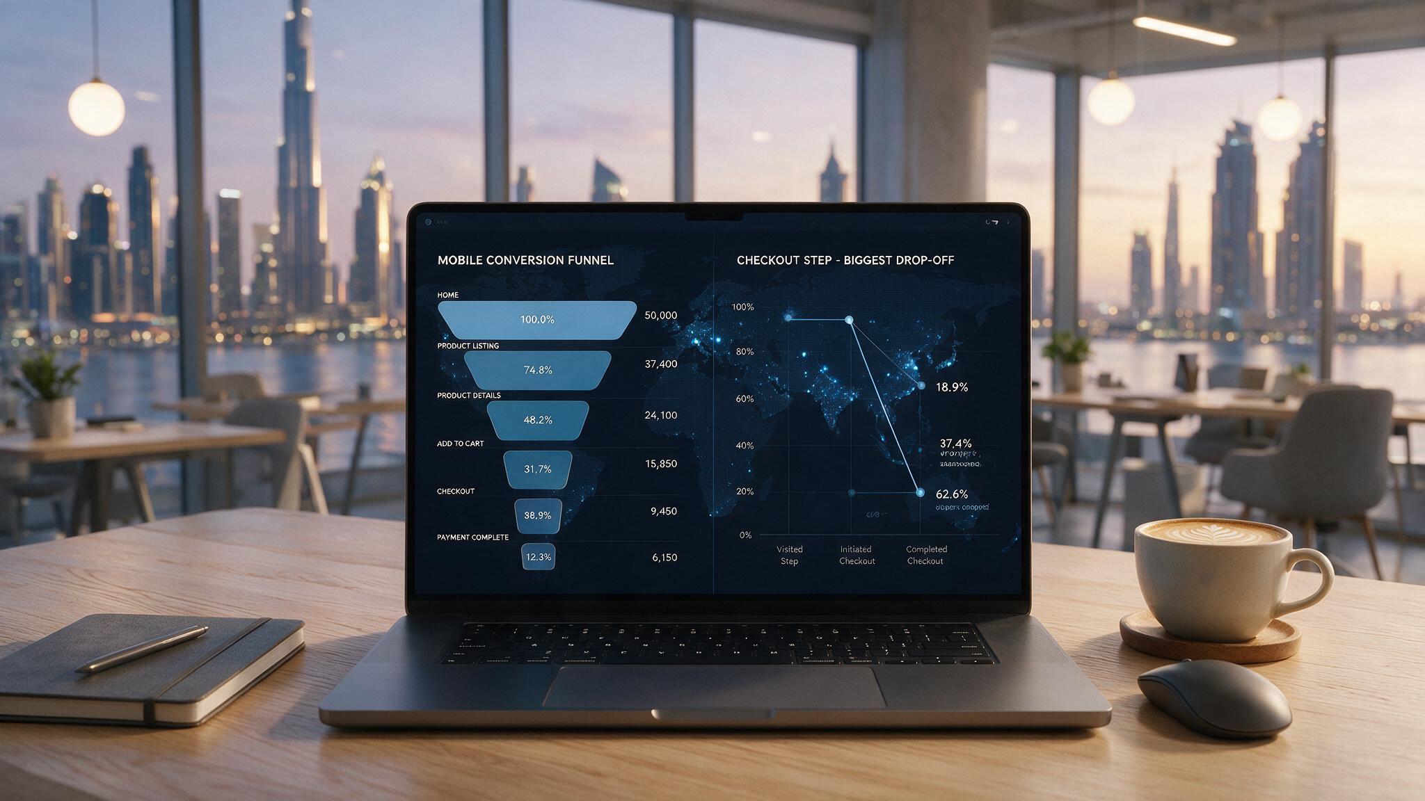
A Dubai e-commerce client came to us convinced their ad spend wasn't converting. The site looked clean on the agency's laptop demo. On a real phone, in real conditions, three things were quietly costing them checkouts:
- Product filters that overlapped the grid once more than two were selected
- A checkout flow where the payment step forced horizontal scroll with no visible scrollbar
- An admin panel the owner couldn't use from her phone, so stock updates waited until she was back at a desk
None of this showed up in a browser resize test. All of it showed up the first time someone tried the site on an actual device, on mobile data, mid-scroll.
Where responsive web design breaks in the UAE market
Responsive web design in the UAE has a few failure points you will not find in a generic checklist, because they come from how business is done here: local payment gateways, bilingual sites, WhatsApp-first customers and owners who run the back office from a phone.
- Filtered product catalogues. Add sort, category filters and pagination and the layout states multiply fast. Chips wrap into the grid, "showing 1-24 of 340" collides with the sort dropdown, and it only shows up once filters are actually applied.
- Checkout with UAE payment methods. Telr, PayTabs, Tabby, Tamara each render their own widget. Each one needs a real-phone check, not an assumption it inherits the surrounding layout.
- Multi-step booking and contact forms. Step one always works. Step three, payment details, date pickers, file uploads, is where testing usually stops, and where the lead usually drops.
- WhatsApp hand-offs. A click-to-chat button that sits under a cookie banner or a sticky footer on a 360px screen is the most common "our leads dropped" cause we see on UAE service sites.
- Admin and back-office panels. If you're managing stock or bookings from your phone between meetings, that panel needs the same standard as the public site. It's the piece most often left desktop-only.
- Arabic and RTL layouts. A flipped stylesheet isn't a second layout. Spacing, icon alignment and form direction all need a dedicated design pass, not a CSS toggle.
This is also why the same brief gets quoted so differently across agencies. "Responsive design that works on desktop and mobile" reads like one line item. In practice it's five or six things that either got tested, or got assumed and skipped.
Responsive design vs adaptive design
People use these interchangeably and they aren't the same fix:
| Responsive | Adaptive | |
|---|---|---|
| How it works | One fluid layout that reflows continuously across any screen width | Fixed layouts served at set breakpoints |
| Maintenance | One codebase to update | Multiple layout versions to keep in sync |
| Best for | Most modern sites, especially catalogues and forms with variable content | Legacy systems or highly specific device targeting |
| What we build | Responsive, by default, on every project | Adaptive only when a client's existing stack requires it |
For nearly every UAE business we work with, e-commerce, services, professional firms, responsive is the right default. Adaptive shows up occasionally on legacy platform migrations where a full rebuild isn't yet in scope.
How we test before launch
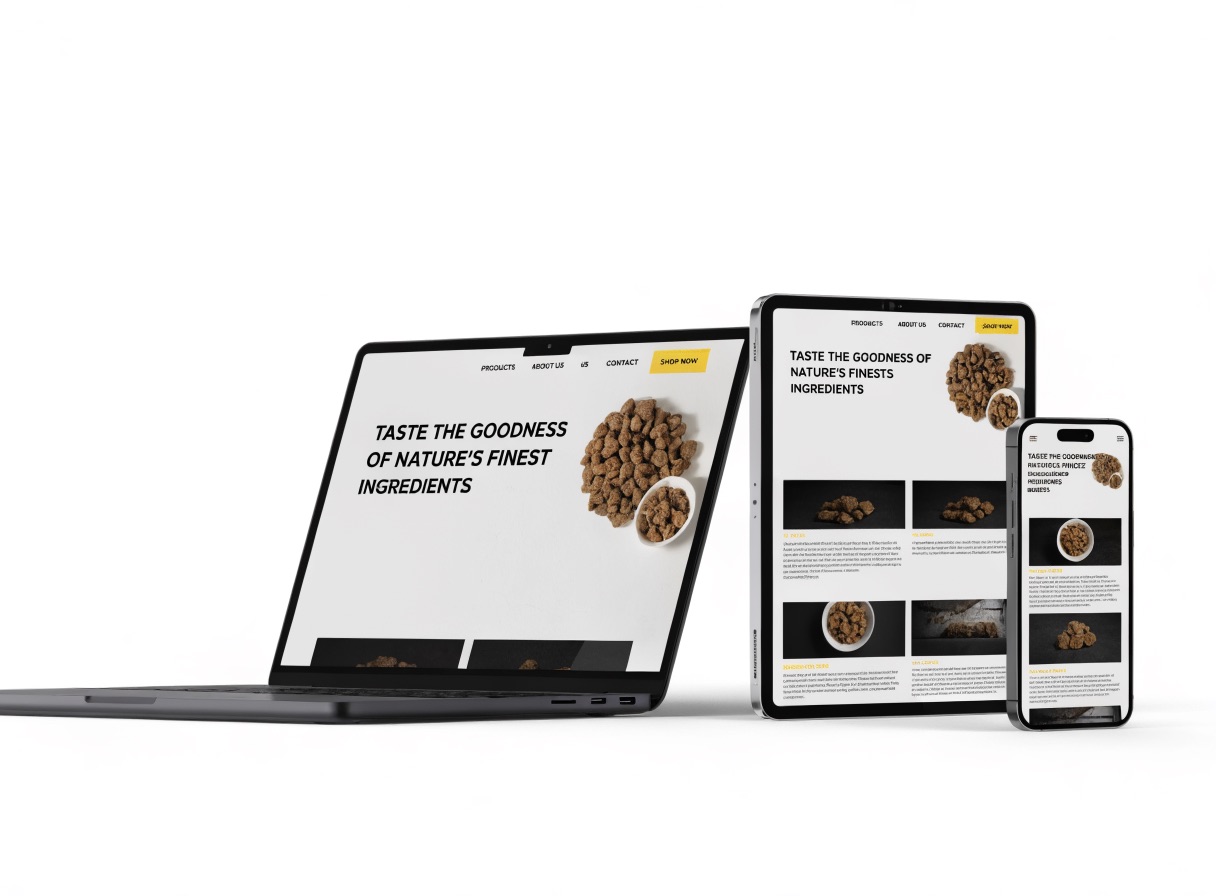
- Scope every template and breakpoint in writing: 360px, 768px, 1024px, plus any admin views, before the quote, not after launch.
- Design mobile-first, then scale up, so the smallest screen isn't an afterthought. Our UI/UX design team wireframes the phone layout first.
- Build custom, not a theme with colours swapped.
- QA on real devices, not just a resized browser window: filters applied, forms filled to the last step, admin panel included.
- Launch with Core Web Vitals checked on mobile, not desktop only: LCP under 2.5s, CLS under 0.1.
Recent builds on this process include S-Line, a logistics platform with a live quote tool and shipment tracking built in React and Tailwind, Frankfurter Kaffeerösterei, a WooCommerce store with advanced filtering and search, and Spectrum Communications, a Sharjah telecoms supplier's site. The full list is on our work page.
Not sure whether your site passes? Send us the URL or message us on WhatsApp and we will run it on real devices and send back a short list of what breaks, free, before recommending anything.
Quick fixes if you can't rebuild yet
If a full rebuild isn't on the table right now, these catch the highest-impact breaks fastest:
- Load the site on an actual phone on mobile data, not wifi: slow connections expose layout shift instantly
- Fill a form to the last step on mobile, not just the first field
- Apply every filter combination on your busiest catalogue page at once
- Check the admin/back-office view if you manage the site yourself
- Tap the WhatsApp or call button on a small phone with the cookie banner still open
- Test Arabic pages separately: don't assume the English QA covers them
What this actually delivers
- Mobile checkout and booking flows that don't silently drop leads at step three
- Admin panels you can actually run from your phone
- Core Web Vitals scored on mobile, not just desktop
- One codebase, tested against a written breakpoint list before you sign off
Honest limitation
A responsive rebuild fixes the site. It doesn't fix a weak offer or the wrong audience finding it. If your traffic isn't converting on desktop either, the problem sits upstream of layout, and we'll tell you that upfront rather than sell you a rebuild that won't move the number.
Why GoDesign
- Custom builds only: no themes, no templates
- Core Web Vitals checked on mobile before launch, not assumed
- Same team designs, builds and QAs the site: nothing handed to a subcontractor
- Visual identity design and the build under one roof, so the mobile site looks like your brand rather than a theme
- 900+ projects delivered, Top Rated Plus on Upwork
- You own the code and hosting from day one
One client's review of a recent build, as posted: "Exceptional website developer! Demonstrated professionalism and expertise from start to finish. They perfectly understood and executed my vision, creating a functional and visually appealing site. Remarkable attention to detail and quality, with a responsive, patient, and feedback-friendly approach."
Frequently asked questions
What is responsive website design? A single website, built on one codebase, whose layout reflows to fit any screen width, so the same page works on a phone, a tablet and a desktop without separate mobile versions. In practice the test is not whether it resizes in a browser, but whether every form, filter, checkout step and admin view still works on a real phone on mobile data.
Why does responsive design matter more in Dubai and the UAE? Because mobile phones generate 75.3% of UAE web traffic (DataReportal, Digital 2026), and many UAE customers arrive from WhatsApp, Instagram or a Google Maps listing, which means they are already on a phone when they land on your site. A layout that only passes on desktop is failing the majority of your visitors.
How long does a responsive website build take in Dubai? A simple brochure site typically takes six to eight weeks and most custom projects eight to fourteen, with the real-device QA round in the final week. E-commerce stores with filtered catalogues and UAE payment gateways sit at the longer end. We fix the timeline in the scope document, not in a sales call.
Can you make my existing website responsive without rebuilding it? Sometimes. If the site is on a maintained platform and the problems are specific, filters, a checkout widget, a form step, we fix those directly. If the theme itself is the problem, patching it costs more over a year than rebuilding, and we will tell you which case you are in after a free real-device check.
Do you test Arabic and right-to-left layouts as part of responsive QA? Yes, as a separate pass. Flipping the stylesheet is not a second layout: spacing, icon alignment, number formatting and form direction all need to be checked on the Arabic pages on their own, on the same phones.
Ready to see where your site actually breaks?
We do a free discovery session before recommending a rebuild or a targeted fix. Most owners are surprised by exactly where the leak is. Talk to us about your website or message us on WhatsApp.