
So, you want to improve your website's conversion rate. The first mistake most people make is jumping straight to A/B testing button colors or rewriting headlines. That’s like rearranging furniture in a house with a leaky roof. You’re fixing the wrong problem.
Before you do anything else, you need a clear, honest look at where you are right now. This isn't about guesswork; it's about building a data-backed foundation for making smart decisions that actually move the needle.
Know Your Numbers: What's a "Good" Conversion Rate?
Let's start with some context. The global average website conversion rate hovers around 2.35%. If you're hitting 3%, you're already doing better than most. But "average" isn't the goal, is it?
The top 25% of websites are converting at 5.31% or higher. The real pros, the top 10%, are seeing conversion rates of 11.45% and beyond. That’s the gap between just getting by and truly dominating your market. It shows you what's possible when you get this right. For more stats, Greetnow has some eye-opening benchmarks.
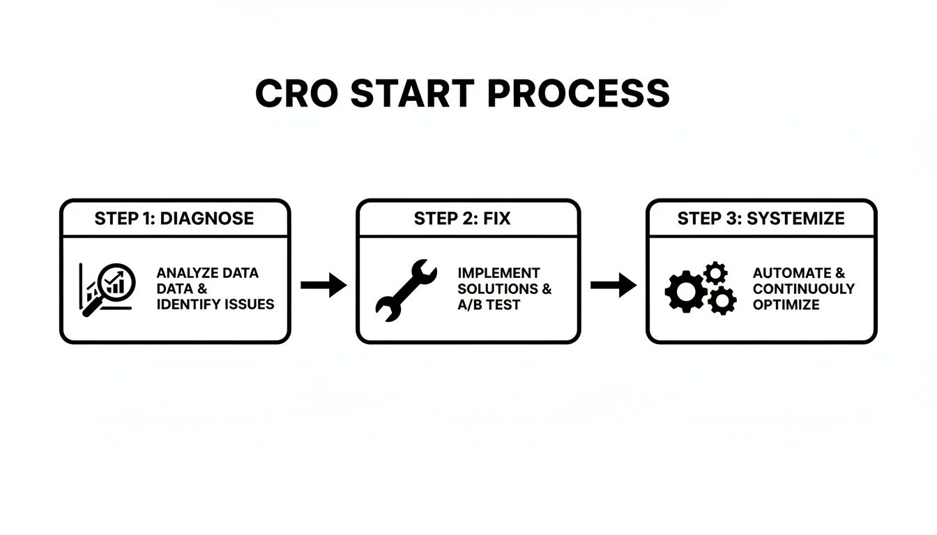
I've seen this simple, three-part framework work time and time again: diagnose what’s broken, fix the obvious problems, and then build a system for ongoing improvement.
This isn't a one-and-done project. True conversion optimization is a cycle—you gather insights, take action, measure the results, and repeat.
Start with a Quick-Win Diagnostic
Think of yourself as a detective for a moment. Your first job is to find the most obvious clues that are stopping people from converting. These are the friction points, the digital equivalent of a locked door or a cluttered aisle in a physical store.
The core idea is simple: Stop guessing what your users want and start listening to what their behavior is telling you. Your data holds all the answers.
We're looking for the "quick wins"—those low-hanging fruit that can deliver a noticeable lift with minimal effort. This is all about identifying and fixing the foundational issues that create a frustrating experience. A great user experience is the bedrock of high conversions, and if you need help getting that foundation right, our UI/UX design services are a great place to start.
Here's a quick checklist to help you spot these common conversion killers. Run through this list on your own site—you might be surprised by what you find.
Quick-Win CRO Diagnostic Checklist
Use this checklist to quickly identify and prioritize the most common conversion blockers on your website. This is your treasure map to finding immediate improvement opportunities.
| Area to Check | What to Look For | Impact Level |
|---|---|---|
| Page Speed & Performance | Load times over 3 seconds on mobile and desktop. Use PageSpeed Insights to check. | High |
| Mobile Responsiveness | Pinching/zooming required, tiny text, buttons too close together on a phone. | High |
| Broken Links & Errors | 404 errors, server errors, or broken images, especially on key pages (product, checkout). | High |
| Confusing CTAs | Vague button text ("Submit," "Click Here"), hidden buttons, multiple conflicting calls-to-action on one page. | High |
| Form Friction | Asking for too much information, no error validation, confusing field labels. | Medium |
| Navigation & Clarity | Is it obvious where to go next? Can users find your products or contact info in two clicks? | Medium |
| Trust Signals | Missing security seals, no reviews, no clear return policy or contact information. | Medium |
By tackling these foundational issues first, you're not just making small tweaks; you're removing genuine barriers that are costing you sales every single day. Once these are fixed, you'll have a much stronger base to begin more advanced testing.
Time to Play Detective in Your Conversion Funnel

If you want to genuinely improve your website's conversion rate, you have to stop guessing. Seriously. Guesswork is a budget-killer, and making changes based on a hunch is one of the fastest ways to waste time and money. The real breakthroughs happen when you trade assumptions for evidence.
This means digging deeper than surface-level metrics like total traffic. You need to become a conversion detective, tracing the user journey to pinpoint exactly where things are going wrong.
Think of it this way: Google Analytics 4 (GA4) is great for telling you what happened—it shows you the high exit rate on your checkout page. But it doesn't tell you why. That’s where tools like Microsoft Clarity or Hotjar come in. A session recording from one of these will show you the user getting frustrated by a confusing error message and giving up. That combination of hard numbers and human behavior is where the magic happens.
Assembling Your Investigative Toolkit
Before you can start analyzing anything, you need to track what matters. This begins with a simple question: what does a "conversion" actually mean for your business? It's not always just a sale.
A conversion is any meaningful action a visitor takes that brings them one step closer to becoming a customer. I like to split these into two camps:
- Macro-Conversions: These are the big-ticket items, the primary goals that directly affect your bottom line. We're talking about a completed purchase, a signed contract, or a submitted demo request.
- Micro-Conversions: These are the smaller, yet crucial, stepping stones that indicate interest and intent. Think of actions like adding an item to the cart, downloading a whitepaper, watching a product demo, or signing up for your newsletter.
Tracking both is non-negotiable. Micro-conversions are the breadcrumbs that lead to your main goal. They help you map the entire journey, not just see who crossed the finish line. When you set these up as goals in GA4, you can build funnels that show you the exact drop-off points between each step.
Finding Clues with Heatmaps
With your tracking in place, it’s time to get visual. Heatmaps are your first piece of hard evidence, transforming abstract data into a clear picture of what users actually see and interact with on your site.
You’ll rely on three main types:
- Click Maps: Show you exactly where people are clicking. You’ll often find people clicking on things that aren't even links, like images or taglines. This is a massive clue—it tells you they expect more information there.
- Scroll Maps: Reveal how far down your pages people actually get. If your main call-to-action is sitting in a "cold" blue or green zone, you have a major problem. Most of your visitors aren't even seeing it.
- Move Maps: These track where users move their mouse, which is a surprisingly accurate proxy for where they're looking. It helps you see which headlines and value props are being read versus which ones are getting completely ignored.
I once saw a scroll map for a client that was just jaw-dropping. 80% of their mobile users never scrolled past the hero banner. All their best testimonials and their primary CTA were completely invisible "below the fold." We moved one powerful quote and the main button into the initial viewport, and their mobile leads shot up by over 30% in two weeks.
Watching the User's Story with Session Recordings
If heatmaps are the high-level crime scene photos, session recordings are the firsthand witness accounts. These are anonymized video replays of real user sessions, letting you watch their entire journey—every click, scroll, and mouse movement.
This is where you stop guessing about why and start knowing. You can literally see frustration happen in real time.
When I review session recordings, I'm always on the lookout for these red flags:
- Rage Clicks: Someone furiously clicking on a button or link that’s broken or just not working. It’s a guaranteed conversion killer.
- U-Turns: A user lands on a page, hesitates, and immediately hits the back button. This screams that the page content didn't meet their expectations from the ad or link they just clicked.
- Form Field Hesitation: The cursor just hovers over a form field for ages. This often signals confusion, a lack of trust (why do you need my phone number?), or a technical issue.
Honestly, watching just five or six recordings of users who abandoned their cart will give you more actionable ideas than spending a week staring at spreadsheets. You're no longer hypothesizing about friction points; you're witnessing them firsthand. This is the raw evidence you'll use to build your A/B tests and optimizations.
Implementing High-Impact Changes Without A/B Testing

Look, I'm a huge advocate for data-driven testing. But let's be practical. You don't need to run a sophisticated A/B test to know you should fix a broken front door. Some website issues are just that—glaringly obvious problems that are costing you money.
These are your "quick wins." They're the low-hanging fruit backed by years of collective industry data and common sense. If your site takes forever to load, you don't need to test if "faster" is better. It is. Fixing these foundational problems will almost certainly lift your conversion rate because they directly improve the user experience.
Make Your Website Blazing Fast
Site speed isn't just a nice-to-have feature; it's a prerequisite for getting anyone to convert. We live in an on-demand world, and a slow website simply feels broken to a modern user. The data doesn't lie: a mere one-second delay in mobile page load can gut your conversions by up to 20%.
Pay close attention to your Core Web Vitals. These are the metrics Google uses to measure real-world user experience. The best place to start is by plugging your URL into Google’s PageSpeed Insights. It will spit out a clear, actionable report card on what to fix.
I’ve seen the same culprits time and again:
- Massive Images: Compress your images before you upload them. Use a tool like TinyPNG; it can shrink file sizes dramatically with almost no visible quality loss.
- Bloated Code: Your CSS and JavaScript files can get heavy. Minifying them strips out unnecessary characters, making them lighter and faster for browsers to load.
- Cheap Hosting: You get what you pay for. A slow server response time will cost you far more in lost revenue than you'll ever save on a budget hosting plan.
Fixing site speed is one of the few things that gives you a double win: a boost to both your conversion rate and your SEO rankings.
Nail the Mobile Experience
More than half of all website traffic now comes from phones. Yet, mobile conversion rates still trail depressingly far behind desktop. Why? It’s not because people are afraid to buy on their phones. It’s because most mobile sites are a total pain to use.
Seriously, pull out your phone right now and try to buy something or sign up for a newsletter on your own site. Don’t just glance at it—actually try to complete a goal.
Are you squinting to read the text? Are the buttons so tiny you keep tapping the wrong one? Do you have to pinch-and-zoom just to get around? Every single one of these "minor" frustrations adds up to a mountain of friction that sends potential customers running.
A truly mobile-optimized experience is so much more than a design that just resizes to fit a screen. It requires rethinking the entire journey for a smaller, touch-based interface. Think simplified menus, big thumb-friendly buttons, and streamlined forms that play nicely with autofill. Make it feel effortless.
Craft Irresistible Calls-to-Action
Your call-to-action (CTA) button is arguably the most important piece of copy on the page. It’s the final nudge that pushes a user toward the finish line. And yet, so many sites fall flat with generic, uninspired buttons like "Submit" or "Click Here." They're conversion poison.
A powerful CTA is clear, benefit-driven, and creates a sense of urgency or ownership. It answers the user’s silent question: "What's in it for me?"
Take a look at these CTA makeovers:
| Vague & Passive | Clear & Action-Oriented |
|---|---|
| Submit | Get My Free Quote |
| Sign Up | Start My 14-Day Free Trial |
| Learn More | Watch the 3-Minute Demo |
A pro tip I always share is to write your CTAs from the customer's point of view. Using words like "My" or "Your" (e.g., "Reserve My Spot") creates a psychological sense of ownership. It’s a small change, but it can make a surprisingly big difference in your website conversion rate.
Simplify Your Forms and Checkout
Every single field in a form is another hurdle for your user to jump. Long, complicated forms—especially at checkout—are one of the top reasons people give up and leave. Be honest, do you really need their fax number in 2026?
Go through every form on your site with a red pen. For each field, ask yourself if it is absolutely essential to complete the task or for you to follow up. If not, cut it.
When it comes to e-commerce, offering a guest checkout is non-negotiable. Forcing a user to create an account before they give you money is one of the fastest ways to increase your cart abandonment rate. Let them buy first, and then offer the option to create an account for easier future purchases. Reduce friction, and you'll see more sales. It's that simple.
Mastering the Art of A/B Testing and Personalization

Alright, you’ve handled the low-hanging fruit—the quick wins are in the bag. Now it’s time to shift gears. We’re moving from fixing what’s obviously broken to systematically finding what works even better. This is where a disciplined approach to A/B testing and personalization comes in, turning your website from a simple online brochure into a true conversion machine.
A/B testing is your secret weapon against opinions and guesswork. It’s a straightforward, controlled experiment: you show one version of a page (the control) to one group of visitors, and a slightly different version (the variant) to another. The data tells you which one wins. Simple as that.
Building Your First A/B Test Hypothesis
Here’s the biggest mistake I see teams make: they just start testing random ideas. A great A/B testing program isn’t about throwing things at the wall to see what sticks. It's about testing smart hypotheses that come directly from the user data you’ve already gathered from heatmaps and session recordings.
A solid hypothesis always follows this formula: "If I change [X], then [Y] will happen, because [Z]."
- The Change [X]: What are you specifically tweaking? Let’s say you’re changing a button from "Learn More" to "Watch the 3-Minute Demo."
- The Expected Outcome [Y]: What metric do you expect to move? Maybe it’s an increase in video plays or a higher click-through rate.
- The Rationale [Z]: This is your “why,” and it should come from your research. For example, "…because session recordings showed people hesitating before clicking 'Learn More,' which suggests they might be afraid of hitting a wall of text."
This framework forces you to tie your test back to a real user problem you’ve observed. That’s what separates a good test from a wild guess. If you're curious about how this user-centric approach shapes design from the very beginning, exploring the process behind creating interactive prototypes can be incredibly insightful.
Prioritizing What to Test First
Once you start digging into your data, you’ll have a flood of test ideas. You can't run them all, so you need a way to decide what to tackle first. Some tests have the potential for huge wins, while others will barely make a dent.
I always recommend using a simple prioritization matrix. It’s a game-changer for bringing clarity to your roadmap and focusing your efforts where they'll count the most.
A/B Test Prioritization Matrix
This simple framework helps you score your test ideas based on a few key factors, giving you a clear, data-informed to-do list. You score each test idea on its potential impact, your confidence in the hypothesis, and how easy it will be to implement.
| Test Idea | Potential Impact (1-5) | Confidence (1-5) | Ease (1-5) | Priority Score |
|---|---|---|---|---|
| Change homepage headline | 5 | 4 | 5 | 14 |
| Redesign entire product page | 5 | 3 | 1 | 9 |
| Change checkout button color | 2 | 2 | 5 | 9 |
| Add trust badges to cart | 4 | 5 | 4 | 13 |
Just add up the scores for each idea. The ones with the highest numbers? Those are your top priorities. Start there.
Beyond A/B Testing to True Personalization
A/B testing is fantastic for finding the best experience for most of your audience. But personalization is where you can see truly explosive growth. It’s about delivering the right experience to the right person at the right time.
Instead of a one-size-fits-all website, you start creating experiences tailored to specific groups of users.
Imagine these scenarios:
- For a B2B Site: A visitor lands on your site from a healthcare company. Instead of showing them generic testimonials, you instantly feature a powerful case study from a major hospital.
- For an E-commerce Store: A customer who previously browsed men's running shoes returns to your site. You greet them with a hero banner showcasing your brand-new line of trail runners.
- For New vs. Returning Visitors: First-timers are greeted with an introductory offer, while your loyal, returning customers see an exclusive "thank you" discount just for them.
Personalization directly addresses the user's context, making your website feel more relevant and helpful. This isn't just theory; it's a proven conversion driver.
One of the most effective ways to personalize is with social proof. Data shows that when users interact with authentic user-generated content (UGC) like reviews, the likelihood of them buying doubles, leading to a 102% increase in conversions. This isn’t a small bump; it proves that showcasing real customer content is a must-do strategy. You can find more details on this finding at WordStream.
You don't need a massive, complex tech stack to get started. You can begin with simple rules based on things like:
- Geography: Show different currencies or shipping offers based on a user’s location.
- Behavior: Target users who have visited a specific page or abandoned their cart with a gentle reminder.
- Traffic Source: Customize your landing page headline to perfectly match the ad or social post they just clicked.
By combining a structured testing process with smart personalization, you'll graduate from making small tweaks to building an intelligent website that consistently turns more of your visitors into customers.
Knowing When to Scale Your CRO Efforts
So, you’ve plugged the obvious leaks. You fixed the low-hanging fruit, ran a few A/B tests, and even saw a nice little bump in your conversion rate. That's fantastic. But now, things feel… stalled.
This is a crossroads I see companies hit all the time. The scrappy, DIY approach that got you those initial wins starts to run out of steam. The question quickly shifts from if you should keep optimizing to how you can do it without hitting a wall. Knowing when you’ve outgrown your current setup is the key to unlocking the next stage of growth.
Have You Outgrown DIY CRO?
Getting started with CRO in-house is the right move for most. But as your business scales, the optimization game gets a lot more complex. The easy wins are gone, and you're now wrestling with more subtle user behaviors and tricky technical hurdles.
It might be time for a more structured, expert-led approach if this sounds familiar:
- You're running on fumes for test ideas. Those initial hypotheses were gold, but now the well is running dry. Your team is struggling to find new opportunities that actually move the needle.
- Your tests are taking forever. If it takes months to get a statistically significant result from a single A/B test, your learning pace is just too slow to compete. You need faster feedback loops.
- Your team is wearing too many hats. Your marketing manager is juggling SEO, paid ads, and now CRO. Your developer is constantly torn between building new features and coding test variations. When CRO is a side-project, it never gets the focus it deserves.
You’ve hit an inflection point. The opportunity cost of not optimizing effectively is now officially greater than the cost of bringing in an expert. Every month you wait, you're leaving revenue on the table that a focused team could be capturing.
From Quick Fixes to a Strategic Growth Program
Partnering with a dedicated CRO agency isn't about just outsourcing a to-do list; it's about fundamentally upgrading your entire approach to growth. You're moving from random acts of testing to a continuous, strategic program built for scale. An experienced partner brings a level of discipline and deep expertise that’s incredibly difficult to build internally overnight.
Here’s a glimpse of what that next level looks like.
Deeper Diagnostics and Technical Audits
An agency will dig much deeper than a surface-level look at Google Analytics. They’ll connect user behavior to your backend data, analyze API response times, and investigate how your own tech stack might be creating friction for users.
A Higher Velocity of Testing
With a dedicated team of specialists, you can run multiple, concurrent experiments across different parts of your funnel and for different user segments. This speed is everything. It’s how you learn faster, adapt quicker, and outmaneuver the competition.
Sophisticated Segmentation and Personalization
This is where the major lifts are hiding. Instead of one-size-fits-all tests, an agency can help you deliver truly personalized experiences based on a user's past behavior, traffic source, or even their company's industry. If you're looking to integrate powerful platforms for this, our guide to HubSpot CRM implementation shows how these systems can be connected for maximum impact.
A Disciplined, Data-First Process
A professional CRO program isn't about guesswork or opinions. It’s a repeatable system: research, hypothesize, prioritize, test, and analyze. This structure takes internal politics and gut feelings out of the equation, forcing decisions to be based on cold, hard data.
Ultimately, scaling your CRO is an investment in speed and expertise. When you realize your team’s time is better spent on your core business, it’s a clear signal you’re ready for a partner to accelerate your conversion journey. This is how you stop just tinkering with your website and start building a systematic engine for predictable, sustainable growth.
Answering Your Top Questions About Website Conversion Rates
When you start digging into conversion rate optimization (CRO), you’ll find it brings up a lot of questions. That’s a good thing. Getting clear answers is the first step before you start making any changes. I’ve heard these same questions from countless business owners and marketing teams, so let's clear the air and get you on the right track.
What Is a Good Conversion Rate, Really?
This is always the first question I get, and the honest answer is: it’s all relative. You’ll see a global average of around 2.35% thrown around, but that number is practically useless without context. A “good” rate depends entirely on your industry, who you’re selling to, and where your traffic comes from.
An e-commerce brand might be thrilled with a 2% conversion rate, while a B2B company focused on lead generation should be shooting for 5% or even higher.
The only benchmark that truly matters is your own. Are you doing better than last month? If you’re already hitting 3%, you’re doing better than most. But don't get complacent—the top 10% of websites convert at over 11%. The goal isn't to hit a magic number; it's to constantly push for steady, incremental growth.
How Long Until I Actually See CRO Results?
This one varies quite a bit. Sometimes, you can see a lift almost overnight. If you implement some of those "quick wins"—like fixing a buggy form or slashing your page load time—you’re removing major roadblocks for your users. The impact can be immediate.
On the other hand, a proper, data-backed A/B testing program is a longer game. A single test might need to run for a few weeks just to gather enough data to give you a statistically significant result you can trust.
Think of CRO as a long-term fitness plan for your website, not a crash diet. You'll see some quick wins right away, but the really transformative results build up over a 3 to 6-month period as you learn and iterate.
Should I Focus on More Traffic or a Better Conversion Rate First?
For nearly every business I've ever worked with, the answer is to fix your conversion rate first. It’s a matter of ROI.
Think about it: spending money on ads to drive traffic to a site that doesn’t convert is like pouring water into a bucket full of holes. You’re just wasting your budget.
Doubling your conversion rate has the exact same impact on your revenue as doubling your traffic, but it doesn't cost you a penny more in ad spend. Build a solid, high-converting foundation first. Then you can turn on the traffic firehose with confidence, knowing every visitor has the best possible chance to convert.
What Are the Must-Have Tools for Conversion Optimization?
You don't need a massive, expensive tech stack to get started. A truly effective CRO toolkit boils down to three types of tools that work together to show you what’s happening, why it’s happening, and how to fix it.
For the "What": You need a solid analytics platform. Google Analytics 4 is the industry standard here. It’s non-negotiable for tracking user journeys, traffic sources, and where people drop off.
For the "Why": This is where behavioral analytics tools come in. Platforms like Hotjar or Microsoft Clarity give you heatmaps and session recordings. They let you see exactly where users are clicking, getting stuck, or rage-clicking in frustration.
For Validating Solutions: Once you have a hypothesis, you need an experimentation platform to prove it. A/B testing tools like VWO or Optimizely are crucial for running controlled experiments and ensuring your changes are actually making things better.
When you combine these three, you have a professional-grade system: find problems with quantitative data, understand the cause with qualitative insights, and then scientifically prove your solutions work.
At GoDesign Technologies, we live and breathe this stuff. We specialize in turning underperforming websites into lean, mean, conversion-generating machines. If you're ready to stop guessing and start implementing a data-driven CRO strategy that gets real results, our team is ready to talk.
Contact us today to learn how we can help you scale faster.
Enhanced by the Outrank app